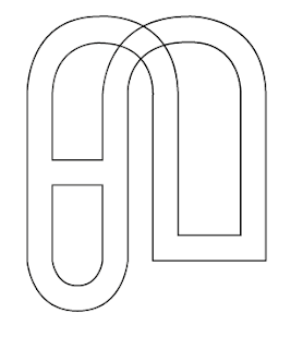
My first initial idea for the logo for Hyperloop was to combine the letters of H and L and see if they could communicate the transportation in an effective way. Trying uppercase and lower cases of the letters helped decide what tone of voice we were going for and if it was appropriate for the target audience. The idea that was most successful for development was using the end points of the capital H and L and connect them together to create more of a fluid aesthetic and represent how connected the consumer be using Hyperloop.

Moving on I tried combing the two letters together to minimise the design and try communicate the message in a more simpler and yet engaging way. This has potential for digital development as it's straight to the point and has a minimal aesthetic which is beneficial towards transport as the customers will need their information in a fast and efficient way to avoid confusion.
I then began to experiment further with a previous idea on connecting the endpoints of the letters H and L. This proved successful in some cases however there is the risk of loosing the legibility of the letters within the design which would make it confusing for the target audience. The concept was connecting people in a fast and efficient way, using the continuous lines on the letters helped communicate this. However the logo cannot be overcrowded and messy as it may cause confusion to the target audience, a simplified version of these experiments may prove a success.
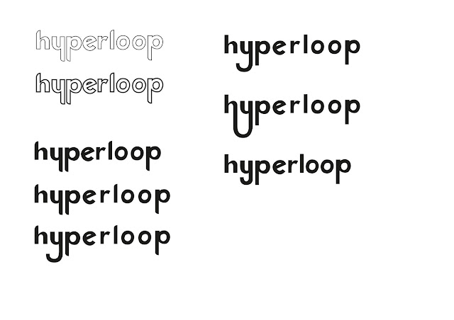
I tried developing the experiments further to be ready for digital development however this proved to cause some errors. As a group we are still torn between the curved or straight edges of the logo however with some feedback from other peers it will be useful to see what works and what doesn't, the top right logo looks too much like the existing Toyota logo therefore that design was scrapped.
From the experiments I had developed I then tried to make them digitally. This proved a much harder task than anticipated and I am grateful I had discovered these difficulties at such an early stage. There is still room for development and tweaking the scale and thickness of the curves/letters etc however I wanted to see what this would look like with colour.
After adding colour I feared the logo appeared too flat, the H and L are still legible however, as a whole the logo does not really look like anything specific. I fear the concept of connecting the ends is too obvious and not creative enough although sometimes the simpler the better.
I then added shadow to various parts of the logo, this helped define the letters H and L whilst adding a bit more depth to the design. The crossbar within the H also could represent the stations/platforms of the train and the rest of the track is one continuous fluid motion. The colour green I had chosen was not a group choice however I wanted to try add some vibrancy to the design and bring it to life, the colour does suggest a more positive and eco friendly atmosphere which is something we want to communicate. The grey experiment I tried suggests a more serious but professional aesthetic offering trust to the consumer.
Beth Taylor
http://b-taylor1316-ppp.blogspot.co.uk/
As a group we came up with different concepts for the brief. We went away and individually started sketching ideas and developing them further based on these concepts. Beth decided to look into the speed and mechanics of the transport and how that can be communicated through type.
Josiah Craven
http://j-craven1316-ppp.blogspot.co.uk/
I looked into the branding for public transport, the simplicity of the logo's and the universal applications to which the simple forms could be put was both inspiring and intriguing.
The purpose of the transport is to get from A to B in an efficient and fast way. The continuous line throughout the design suggests the connection from one location to the next, in an effortless and effective way. The smooth curves help connote the smooth new tech that enables this form of transport to be so effective.


