As I'm trying to get myself more exposed as a designer, I have created a Behance account to showcase my work. Although not all of my work is on there at the moment I am hoping as the year progresses it will gradual become a collection of work that I am proud of. This gives me opportunity to get my work online for other creatives to critique and give me feedback on.


I also finally made an Instagram account for my design work. So far this appears to be increasing in followers the more work I put on. My biggest issues I've faced the past two is having the confidence to be proud of my work and to put it online, its a task I've had to really shout at myself for as how will people know me as a creative if they cannot see my work. Therefore I have chosen to stop being a wimp and not think about being judged and just get myself out there. 


Here is a website I built on WordPress in September. It showcases the work I have made so far giving descriptions of the briefs I have made and how I have found the solutions to the briefs. This website is gradually gaining more traffic although I have not made a post in a while, this is something I am going to pick up and add too once university it over. I feel its a good platform to show my work at the best possible quality, it also helped me find my first client who wanted to buy a print for her friend.


This was the first time I had been approached from a member of the public to design something for them. This proved a good experience as I had not communicated as a professional before therefore it gave me the perfect opportunity to act as creative and address the client in a professional manner. Lindsey had spotted a design I had made in second year of uni on a website I created back in September, this was when she contacted me to ask for a print. I gave her the option to pay via paypal and offered a variety of sizes for the prints, this was useful as Lindsey did not know the measurements I had gave her (A4, A3, A2, A1) and me forgetting that I'm a designer who's been conditioned to know these dimensions gave Lindsey more understandable measurements for her to choose from. The process I chose to do was screen printing, I felt this would give the design a more hand crafted feel and giving Lindsey the best quality she could get for her money, it also reduced the cost of me making the brief so there was more profit to be made.

One concern I had was I did not realise the client was from America. I had included the p&p with the print which caused concern when I researched into the prices to send a package to America, this was solved however as I contact Lindsey and explained the situation, she was a very understanding person and wanted to help me as much as possible.


The print screen printed and ready to send!


Lindsey eventually got her print which I am pleased that it got there in one piece.


I visited Something More studio to get some advice from industry professionals. Jon greeted me and we sat down with a coffee and discussed everything his studio had to offer and how they got to the place they are now. Jon was very informative on the process they take starting from client to execution, as it seemed a similar creative process to the one I do at university it was a relief to discover that I may be able to handle work experience in industry. I asked Jon what they look for in other creatives to which he responded with: confidence. He explained how they look for creatives with a spark of some kind that can think and react differently to others, that they must be confident about their work and ideas.


After receiving feedback on my business cards I was made aware that my logo did not necessarily communicate my name or look look a pencil like it was intended. I then experimented with different lines and colours until the logo was more successful. 

Although the logo resembles a pencil rather than my name, I think it's stronger than the previous logo. With that in mind I want to continue develop the logo until I am satisfied, so far the 'v' and 'a' are clearly visable however, the 'e' is gets slightly lost as the extended crossbar touches the bottom of the 'v' making it look like a 'y'. This can be used for now but will be developed in the near future. A the pencil represents myself as a designer, I felt the colours needed to communicate my physical appearance, therefore I simply went for yellow to reflect my hair and green as I have green eyes.


This is the CV I have made to reach other creatives and agencies. The layout is very clean and minimal yet communicates the information clear and effectively. As my portfolio will be showcasing my work and what I do I felt that my CV needed a sense of formality. However, this will be a continued work in progress and will still need developing before reaching out to the industry, I feel it lacks character and is not exciting enough to keep the viewer interested. 


These are the business cards I had developed further. Due to an error one of the lines is missing on the back of the business cards however, these are still a work in progress as I do not feel they are exciting or engaging enough for the viewer. The same yellow and dark grey theme applies throughout and I tried to duplex the business cards myself to bring substance and detail to the cards. Trying different colours such as green, yellow and black all achieved different affects. The most successful however was the yellow duplex as it went with the yellow pencil a lot better and did not stand out too much.


Elmwood are another studio that is situated in Leeds. After visiting our university for a one day brief I thought it would be beneficial to research into the studio and see what they did. As it stands they appear to be a very established agency that have multiple studios across the world. They offered services such as branding and packaging which looked very creative and professional, this is something I want to focus my practice on so will look further into contacting them to seek advice.


Something More is a studio situated in Leeds. After noticing their work in Leeds train station I decided to investigate into the studio that made it. Something more are a three man studio that has recently opened in the past year, their work consists of various projects including print and branding. This was something of an interest me so my plan is to contact them and get some advice and learn more about what they do.


- First year: How overwhelmed I was with the work load, intensity of course, living independently.
- Learnt new skills such as screen-printing, book binding, InDesign, embossing.
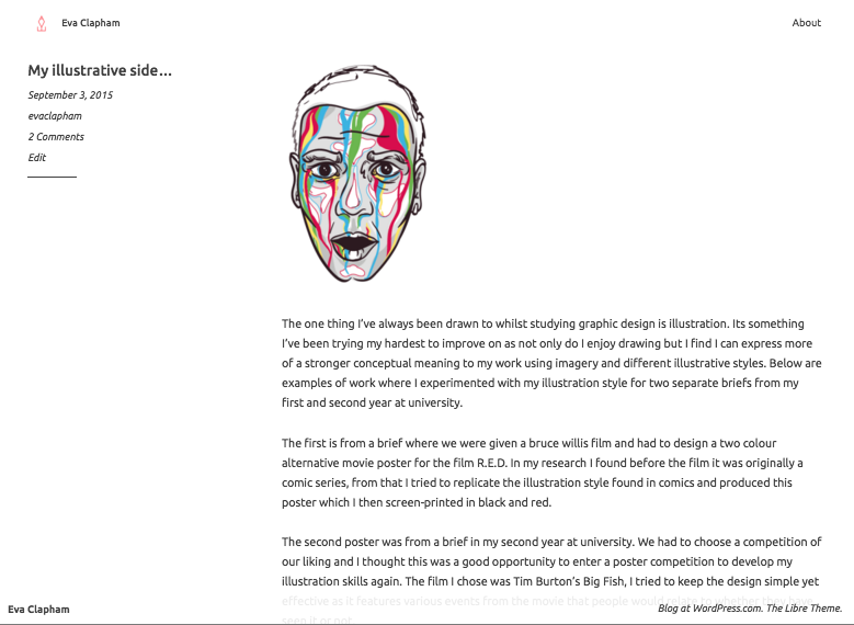
- Always used a form of illustration in my work
- Second year: Very lost and confused as to what I wanted to do
- Lost sense of direction when it came to briefs, struggled to keep on top of work load and produce outcomes I felt confident with
- Explored too many different fields within graphic design, I enjoyed this but it left my more confused as to what I was good at and what I wanted to do

- More stability with health, meaning more stability and foundation for work
- Always been pulled towards the illustration side of briefs
- Found what I am good at to utilise in briefs.
- Better understanding of graphic design and illustration
- Enjoyed the opportunities to collaborate with other students in the college and answer briefs I would not usually go for.
- Helped me get bette at communicating with other creatives to share ideas
- Experience gained with difficult collaborations
- Self promotion improved from last year
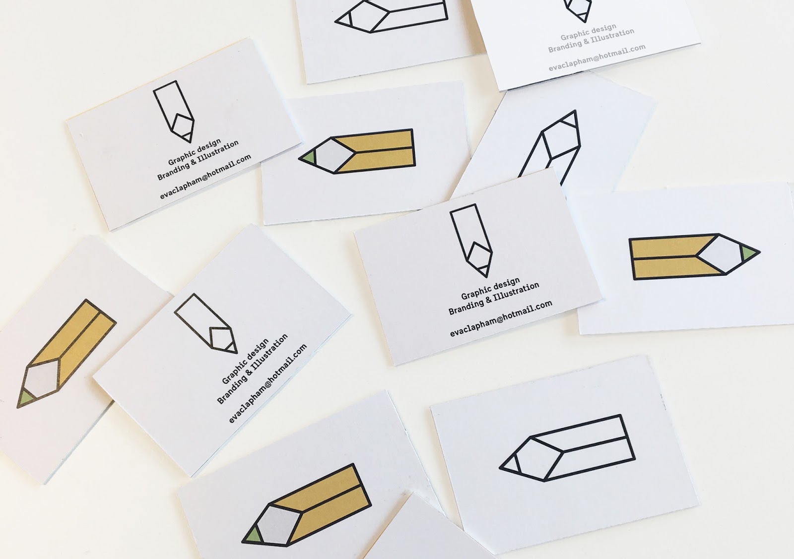
- Finally designed a logo and business card I was happy with
- Feel more comfortable using programmes such as Photoshop, InDesign and Illustrator.
- Myself as a designer, always been pulled towards illustration and branding.
- Have a love for creative, clever and bold design that tells a story
- Heavily concept driven which sometimes affects the outcome of my work.
Intentions before I leave
- build a portfolio with a body of work that represents myself as a designer and offers a variety of skills.
- Visit more studios, get portfolio feedback from other studios and hopefully some work experience
- Get more experience from live clients
- Utilise the uni's resources, screen printing!! I am going to miss having the university's facilities so accessible and free to use, therefore the briefs I have left to do will hopefully make use of the facilities.
- Have fun whilst I can! Not long left and so far third year has been my favourite year yet therefore I want to keep on top of my work and enjoy it as much as I can whilst I can.

- Looking into studios in Leeds as I would like to continue living here once graduated
- Visiting Berlin over the holidays so it would be useful to visit some studios


1.Complete a short statement about yourself.
I'm an independent designer who loves to collaborate. Using illustration and mixed media has formed many skills to reach the solution to creative problems at a professional standard. 


2.Complete a short statement about your technical skills.
My technical skills vary from many of the Adobe software such as Photoshop, Illustrator and InDesign. Over the two years of university my skills in these programmes are continuously developing which has enabled me to learn and stretch my creative skills to new possible outcomes.

3. Complete a short statement about your work experience.


4.Complete a short statement about your ability to work in a team and independently (with examples).
My time at university has offered opportunities to collaborate with people externally and internally, it also has left room for me to work independently on briefs. Both abilities have improved my organisation skills and gained experience with other disciplines other than graphic design. 


5.Complete a short statement about your communication skills (with examples).
My communication skills have improved over the course of my university experience, speaking in front of a crowd of peers has helped the development of my presentation skills and highlighted weaknesses that I need to improve. Communication via email has also improved as I've been guided by tutors and other peers on what is appropriate and what isn't. 

6.Complete a short statement about your understanding of graphic design (with examples).
Graphic design to me is the ability to form a solution to a creative problem. Using visuals to communicate this solution in the most effective and engaging way and to ensure it answers the brief or client in the most appropriate manner. 


My first initial idea for the logo for Hyperloop was to combine the letters of H and L and see if they could communicate the transportation in an effective way. Trying uppercase and lower cases of the letters helped decide what tone of voice we were going for and if it was appropriate for the target audience. The idea that was most successful for development was using the end points of the capital H and L and connect them together to create more of a fluid aesthetic and represent how connected the consumer be using Hyperloop. 


Moving on I tried combing the two letters together to minimise the design and try communicate the message in a more simpler and yet engaging way. This has potential for digital development as it's straight to the point and has a minimal aesthetic which is beneficial towards transport as the customers will need their information in a fast and efficient way to avoid confusion. 


I then began to experiment further with a previous idea on connecting the endpoints of the letters H and L. This proved successful in some cases however there is the risk of loosing the legibility of the letters within the design which would make it confusing for the target audience. The concept was connecting people in a fast and efficient way, using the continuous lines on the letters helped communicate this. However the logo cannot be overcrowded and messy as it may cause confusion to the target audience, a simplified version of these experiments may prove a success. 


I tried developing the experiments further to be ready for digital development however this proved to cause some errors. As a group we are still torn between the curved or straight edges of the logo however with some feedback from other peers it will be useful to see what works and what doesn't, the top right logo looks too much like the existing Toyota logo therefore that design was scrapped. 


From the experiments I had developed I then tried to make them digitally. This proved a much harder task than anticipated and I am grateful I had discovered these difficulties at such an early stage. There is still room for development and tweaking the scale and thickness of the curves/letters etc however I wanted to see what this would look like with colour. 


After adding colour I feared the logo appeared too flat, the H and L are still legible however, as a whole the logo does not really look like anything specific. I fear the concept of connecting the ends is too obvious and not creative enough although sometimes the simpler the better. 


I then added shadow to various parts of the logo, this helped define the letters H and L whilst adding a bit more depth to the design. The crossbar within the H also could represent the stations/platforms of the train and the rest of the track is one continuous fluid motion. The colour green I had chosen was not a group choice however I wanted to try add some vibrancy to the design and bring it to life, the colour does suggest a more positive and eco friendly atmosphere which is something we want to communicate. The grey experiment I tried suggests a more serious but professional aesthetic offering trust to the consumer.   

Beth Taylor
http://b-taylor1316-ppp.blogspot.co.uk/


As a group we came up with different concepts for the brief. We went away and individually started sketching ideas and developing them further based on these concepts. Beth decided to look into the speed and mechanics of the transport and how that can be communicated through type. 

Josiah Craven 
http://j-craven1316-ppp.blogspot.co.uk/


I looked into the branding for public transport, the simplicity of the logo's and the universal applications to which the simple forms could be put was both inspiring and intriguing. 
 The purpose of the transport is to get from A to B in an efficient and fast way. The continuous line throughout the design suggests the connection from one location to the next, in an effortless and effective way. The smooth curves help connote the smooth new tech that enables this form of transport to be so effective.


Powered by Blogger.

About

Search This Blog